A big congratulations to my cousin Michael and his new bride Elise! I had so much fun designing the invitation suite for such an awesome couple – they truly deserve all the happiness in the world
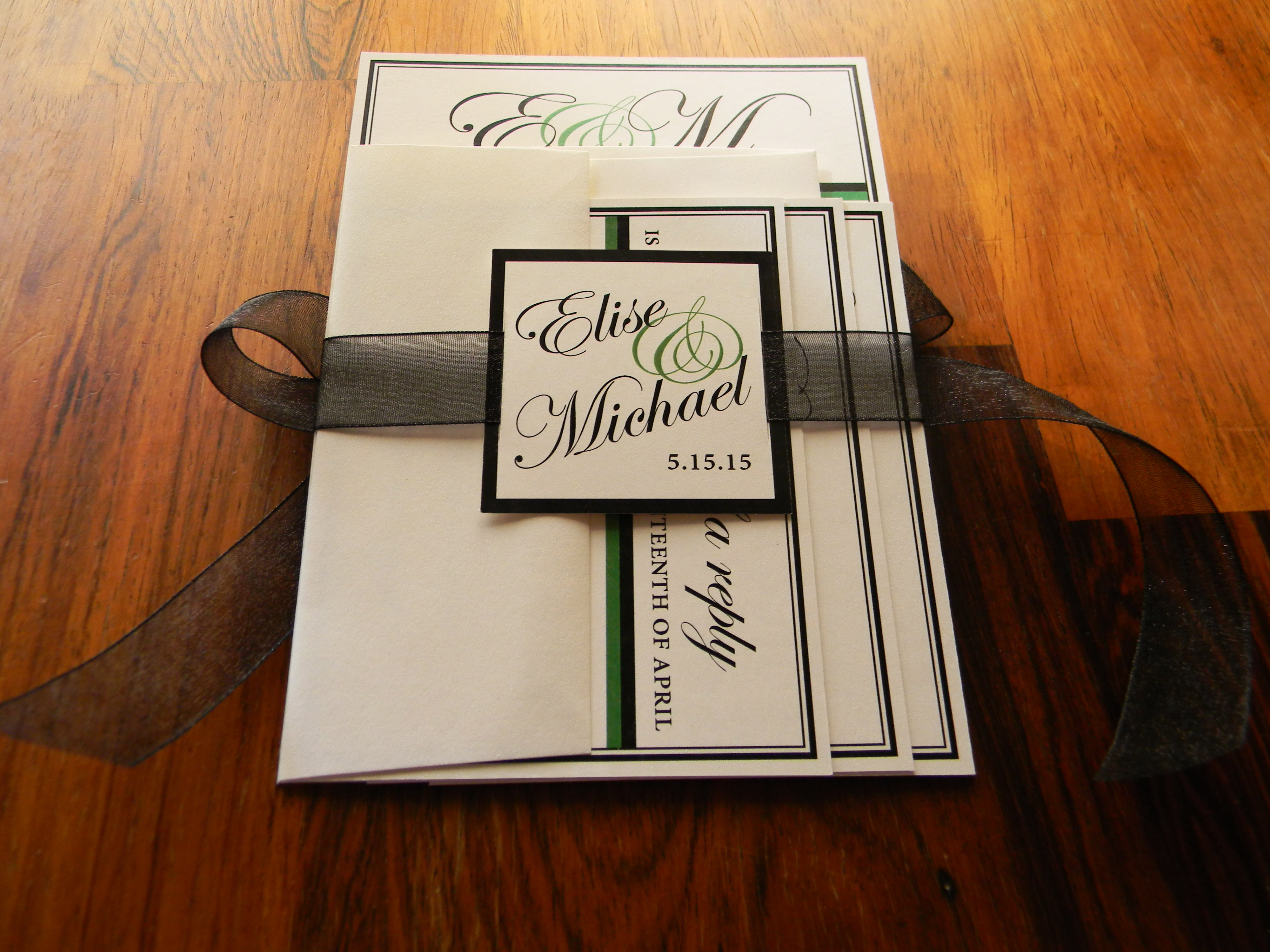
This first image shows how the invitations were packaged and sent – neatly wrapped with a sheer black ribbon which was tied in a bow in the back. I threaded the ribbons through square cards with the bride and groom’s names and wedding date to give it a more polished look.
Invitation suite all packaged up and ready to be mailed!
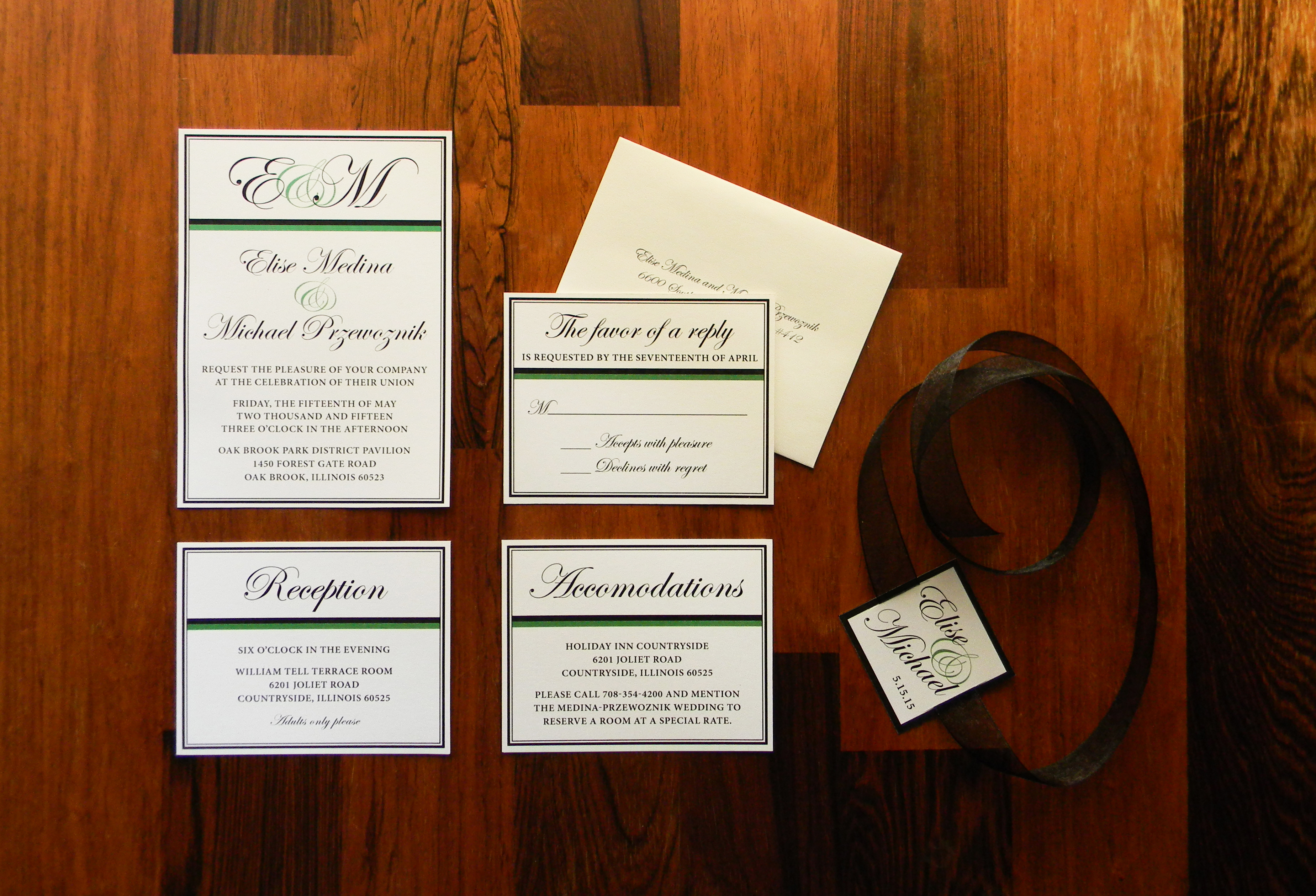
Here we have all of the elements unwrapped – the invitation along with the reception, accommodations, and reply cards. I printed the address on the return envelopes using the same script font as the rest of the suite.
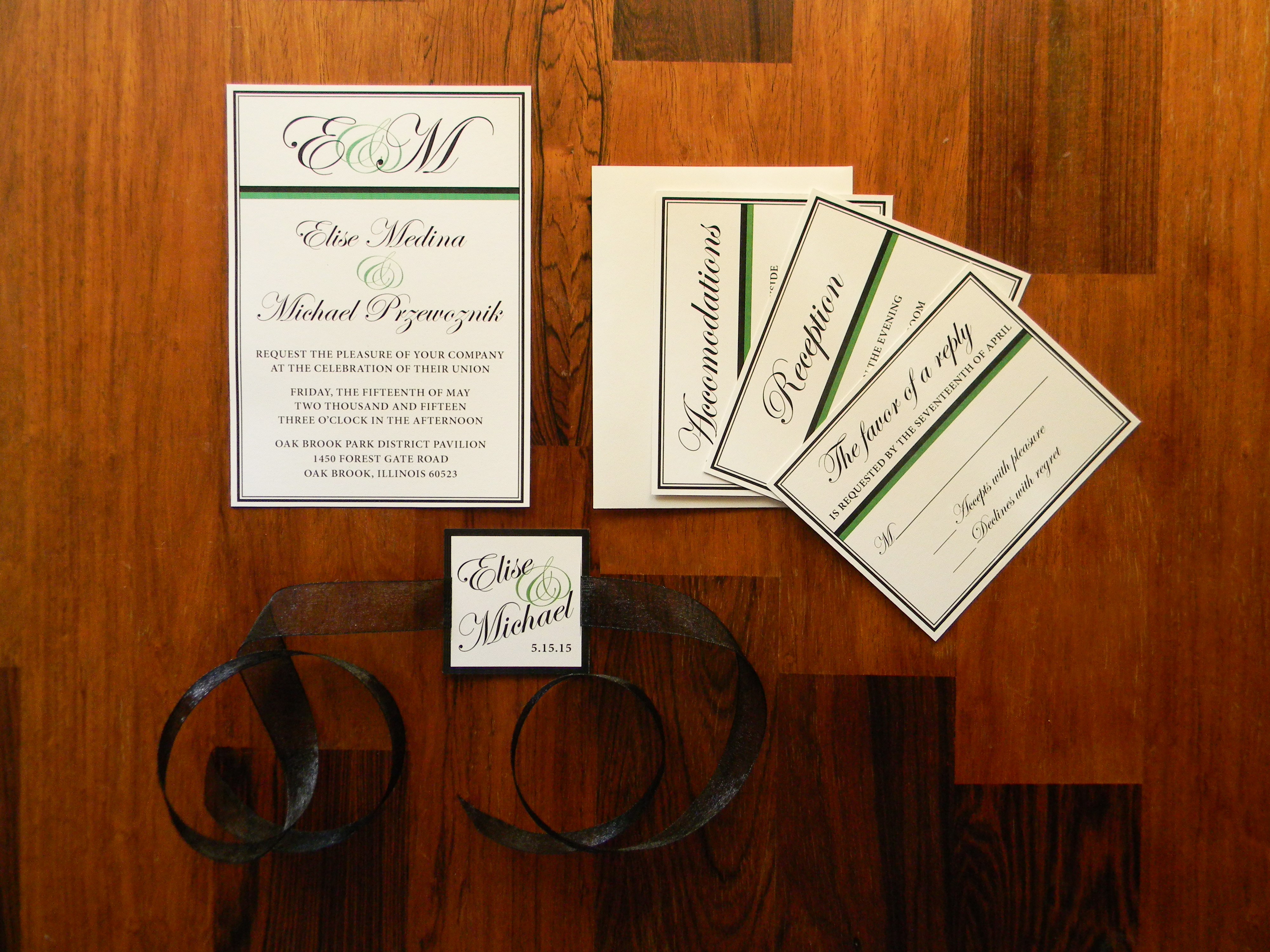
All of the pieces laid out.Another shot just for fun :)
This was such a special project for me – I’m so happy I was able to contribute to their big day. Congrats again guys!
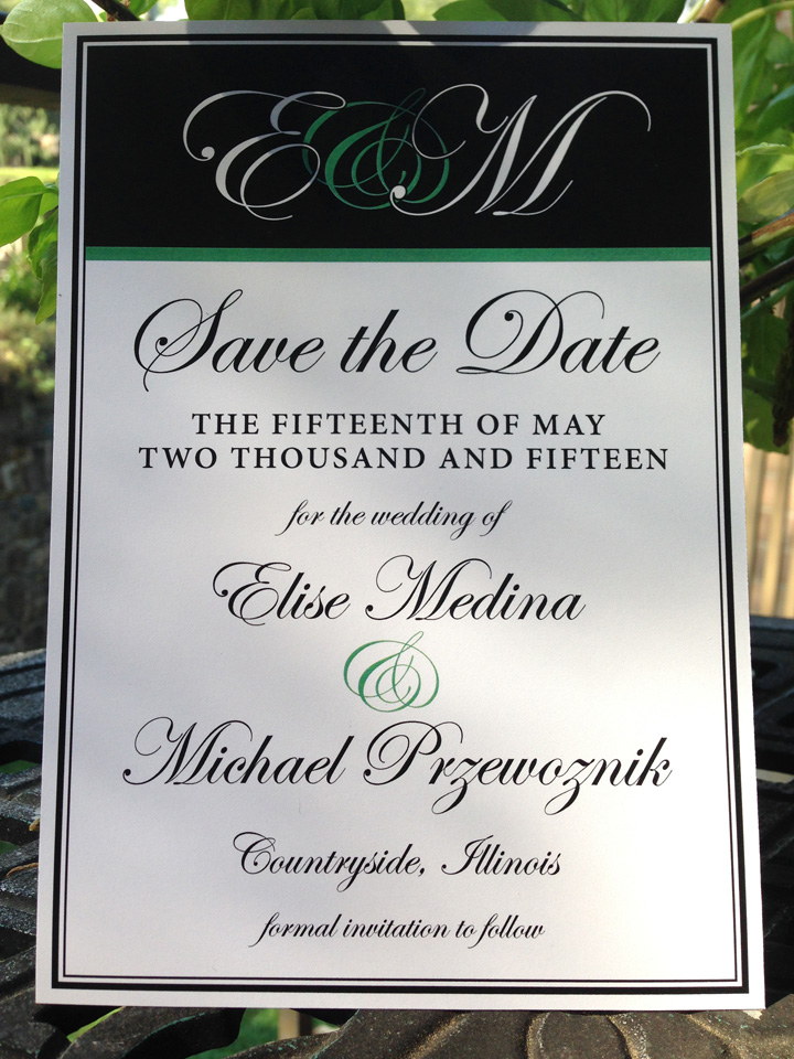
I’m so excited to share this Save-the-Date I created for my awesome cousin Mike and his lovely fiancée Elise! Their wedding colors are black and emerald, and they chose Neenah Environment 100lb cover in Natural – a nice heavy paper that is also environmentally friendly. The rest of the invitation suite is still in progress – check back later for a full post
Ah, weddings. I love designing for weddings. The invitation is the first hint your guests will see of your personal wedding style, and can set the tone for every other choice you make in the planning stages.
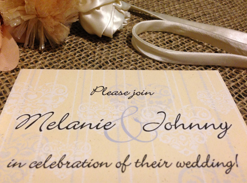
For this particular wedding, the mother of the groom was my contact throughout the whole process – I never actually spoke with the couple. It was a unique challenge for me because the only information I had to work with was the basic “Who, What, When, and Where”… I had no idea what look or theme the bride and groom were going for. I decided to create four very different designs and emailed them to the future MIL, hoping one would catch their eye. They in fact loved two of the styles, so I printed out proofs of both (sometimes seeing the actual invitation in your hand can make up your mind for you).
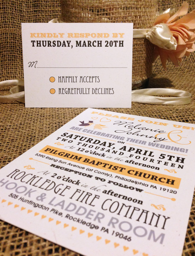
The wedding colors were red and yellow, but I wasn’t sure which color was going to be the main hue for the event. Since it was an early spring wedding, I felt that a light yellow would be a great color for the invites – reminiscent of daffodils and fitting for the time of year.
For the first option I used pale yellow for the background, overlaid with lacy heart graphics in light gray and white. This was my “romantic” design, simple and pretty.
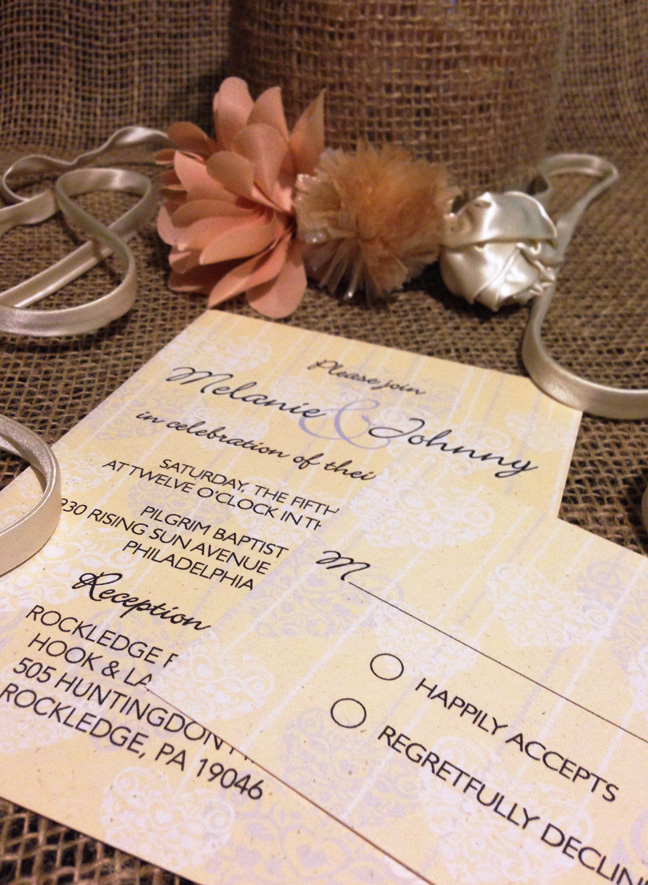
First optionInvitation and response card
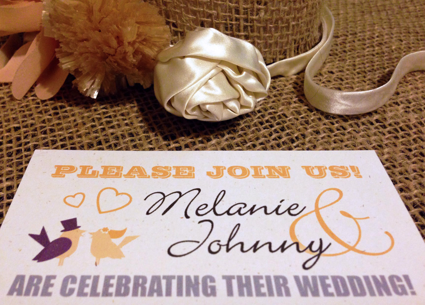
The second style they liked was my “typography” design. This invitation style has become increasingly popular over the last few years, much to my delight. Focusing on the fonts instead of images and graphics can make a visually appealing and fun design. For designers, it’s almost like putting a puzzle together when all of the pieces are completely different sizes – it takes a lot of thought, planning, and careful placement.
Second optionInvitation and response card
And the final choice was…. Option #1! “Romantic” for the win
Every year for Thanksgiving, my mother-in-law hosts a massive dinner for the whole extended family. With sisters, brothers, aunts, uncles, cousins, parents, and grandparents, the head count comes in at around sixteen, give or take a few. All of the “kids” (my husband, his sister, their four cousins, my brother, and myself – still referred to as “the kids” by my in-laws) would always end up in the basement, drinks in hand, playing pool.
Well, a few years ago, my in-laws decided to retire to South Carolina. They are still in the process of transferring their belongings down there, but one of the first things they took was that wonderful pool table, and with it the possibility of continuing our Thanksgiving After Party tradition. Determined to keep the spirit of our little ritual alive, I decided to host a game night party for all of the “kids,” complete with formal invitations.
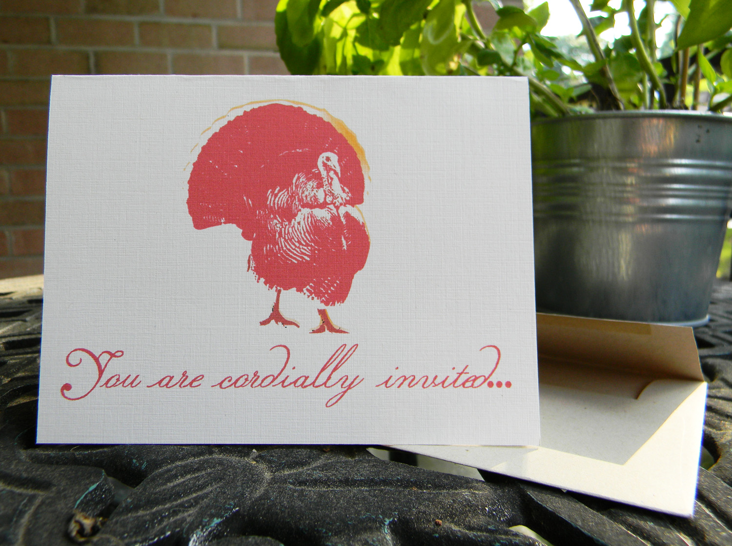
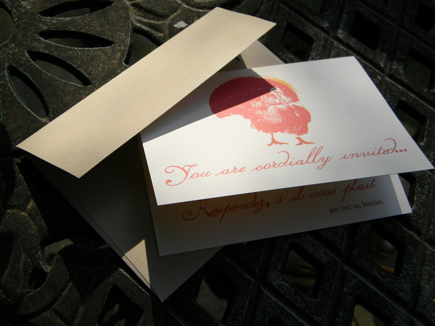
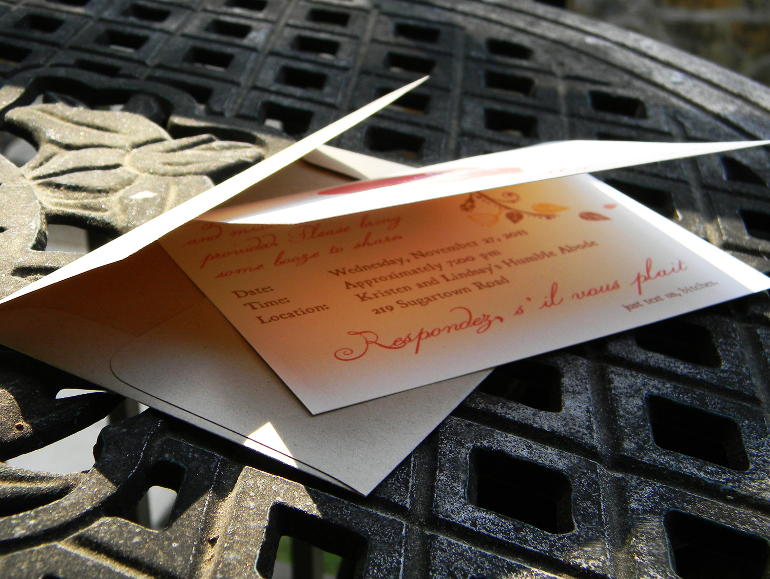
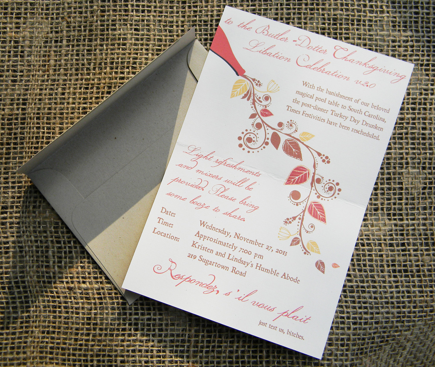
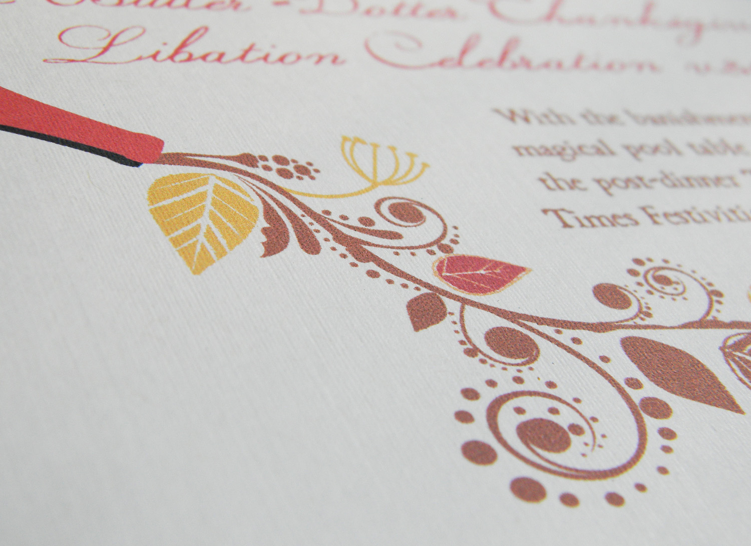
Thanksgiving Party Invitation, with my lovely basil plant as a backdrop.I was able to use the Neenah Environment – Desert envelopes I had left over from my wedding.I liked the light showing through the paper here.For the interior design, I added a wine bottle graphic to emphasize the alcoholic nature of the party. I then added a leaf and vine illustration to make it look a little classier ;)I used Neenah Classic Linen 80lb. Cover. I just love this textured paper – almost looks like woven cloth.
This was a very enjoyable project for me. I’m drawn to the rough, rustic design style (you’ll see Blackbeard show up in my font rotation quite often), but I love to mix it up with some flowy script or swirly graphics. The party was a hit, and I’m already brainstorming invitation designs for this November.